Klae Wellness.
PHOTO CREDIT: NIC STEPHENS PHOTOGRAPHY
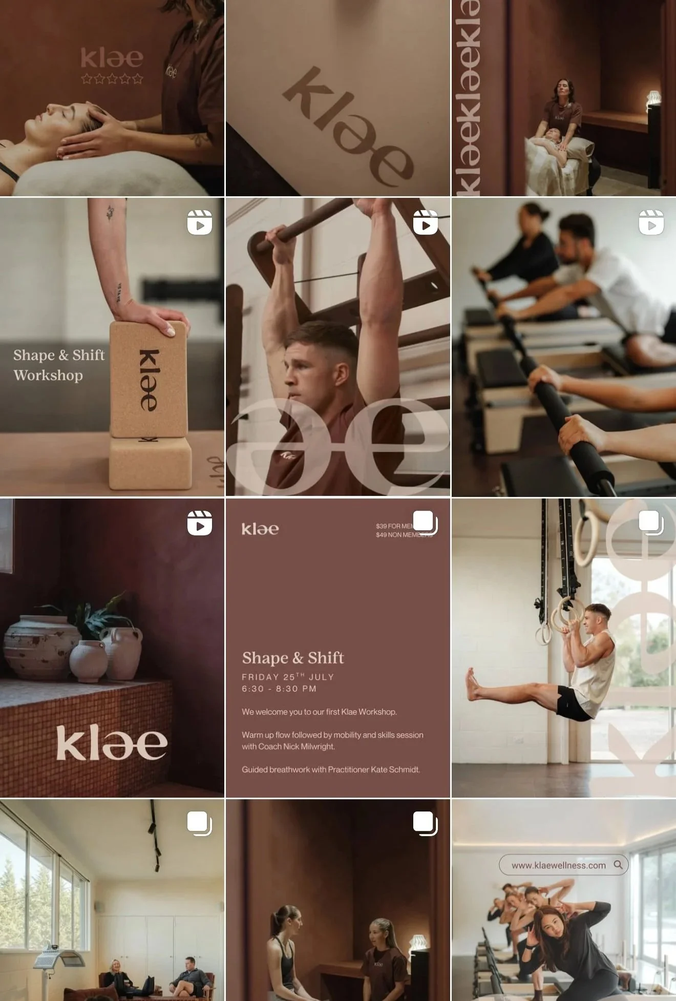
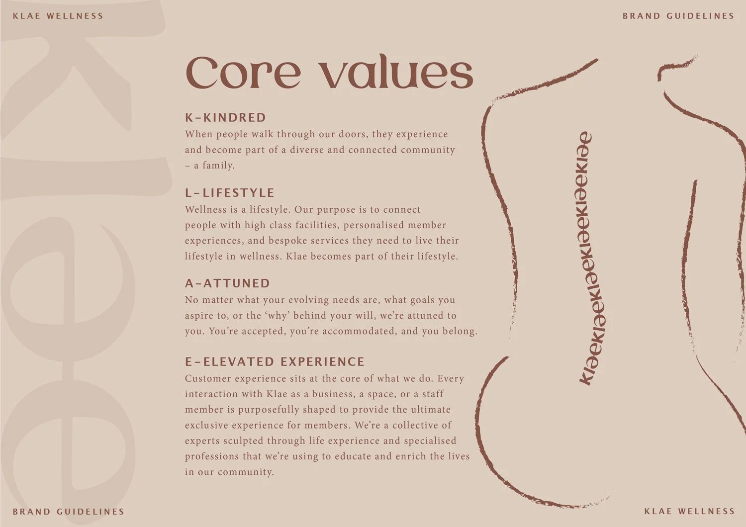
Klae is the space where every body can piece together their wellness. Sculpted by a collective of experts in health and wellbeing, every room at Klae is a dedicated high-class space designed to challenge, nourish, repair, and reform the body. The memberships are bespoken to your evolving needs, the staff are always attuned to your goals, and the community are kindred.
It’s old-world service with new-world contemporary facilities. It’s an atmosphere that uplifts. It’s wellness from the core. It's Klae.
SERVICES PROVIDED:Brand Strategy Seminar
Brand Strategy
Brand Identity Design

Project Overview:
The Klae team came to us at the very start of their journey with only a name and a vision for a new business venture. They needed more than a logo. They needed a brand.
Be Franc. crafted a brand story that gave Klae meaning, transforming it from a unique word into a brand with depth and purpose.
The underlying concept drew inspiration from the idea that clay, like Klae, forms the foundation of our world. When sculpted, connected and reshaped, it can emerge as something refined and transformative. This concept reflected the core values and the health and wellness services offered at Klae.
Through brand strategy, we defined their target audience, created a tone of voice and designed visuals that felt both welcoming and elevated, while paying homage to the ancient and Japanese traditions that inspired some of their services.
The colour palette, logo and iconography were designed to evoke a sense of elevated luxury
and sophistication, while remaining inclusive
and never elitist.
As always, the goal was to build a distinct and memorable brand that stands out in a saturated market and attracts its ideal audience.
The result? A cohesive brand suite, complete with strategy, identity design and guidelines, ready for the team to execute consistently across all touchpoints.


Behind the design.
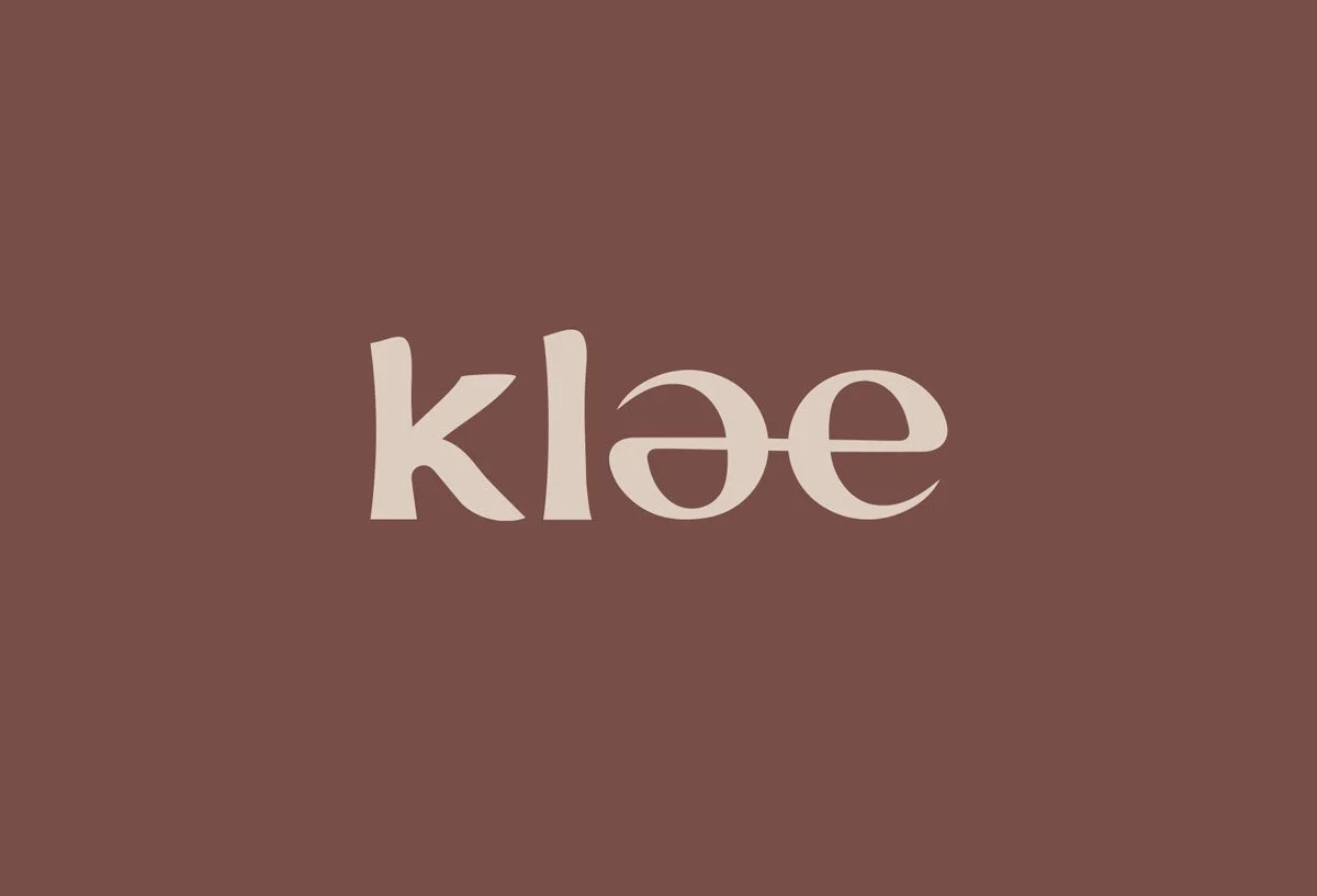
The Klae logo thoughtfully blends meaning and symbolism into its design, creating a visual representation of the brand’s essence.
The connection between the ‘a’ and ‘e’ forms a new, unified shape, subtly reformed from the ‘e’. This design choice represents the core philosophy of Klae - balance, transformation and connection. The interplay between the letters creates an abstract yin and yang symbol, symbolising harmony, unity and inclusivity. It reflects the idea of two distinct parts coming together to form something new and whole, much like clay being shaped into form.
This concept also mirrors Klae’s approach to wellness: a connected and supportive community that embraces individuals on their journey of self-investment and transformation.
Furthermore, the logo contains a subtle nod to ancient traditions, with an understated Japanese influence in the letterforms. The gentle curves and balance within the design evoke simplicity, mindfulness and timelessness - qualities often associated with Japanese design and philosophy.
Overall, the Klae logo strikes a balance between modern sophistication and heritage, encapsulating the brand’s dedication to holistic well-being, inclusivity, and the art of transformation.
Working with Eliza was an incredible experience. Eliza was professional and patient as we worked together over months while we 'shaped' our newest business venture. Giving her the difficult task of weaving a strong narrative for a pre existing name, she went above and beyond creating an incredible brand identity that aligned perfectly with our vision for the space. She was always available to work through ideas. We loved Elizas energy, expertise and 'franc'ness and would recommend her to anyone looking to stand out from the crowd.
— Klae Wellness.


